Showing posts with label paint. Show all posts

Friday, January 30, 2015

Best return for your $


|1|
We all know kitchens and bathrooms bring you the best return on your investment in remodeling, but also curb appeal, new windows and repurposed spaces are also high up there.

The least expensive thing you can do with the biggest impact?
paint

Just do it we say!

|2|


Wednesday, November 21, 2012

2013 color forecast

I know there are many forecasts from different manufacturers, but today I found that Sherwin-Williams picked Aloe as the 2013 color of the year:


I am surprised a bit, since I used this color several years ago in my home and I'm thinking it's not THAT current. But I love it still.


Pantone has picked Monoco Blue as their 2013 Fashion Color of Spring ( doesn't sound like they are committing to a whole year!) Their Home Color of the Year hasn't been announced yet.
 Funny that they don't pick the same color...who is right?  P.S. This is the color of my kitchen I painted 10 years ago.


Here is Sherwin-Williams 2013 color forecast.  Remember our post on Monday? Now these are some saturated colors!


Here is a room example of this:


or this fabulous vintage fabric:


Check out SW's 2013 dark and moody collection ( Bethany will like this):


( DeGourney's the best aren't they?)


SW's Pastels:


 SW's Earthy "Honed Vitality"tones:


Here are the Pantone 2013 colors for fashion and home:


What do you think?

Nancy

Don't forget to enter our book  GIVEAWAY


1/2/3/4/5/6/7/8

Looking for help with your home? We have consulting services starting at $50. Contact us today for information.

Monday, October 15, 2012

How to frequently redecorate

I know most of you are addicted to re-doing rooms over and over like we are, but in case you have had your furniture in the same spot for a long while, or yearn for a new look to go along with a new season, here are some things we do at Powell Brower.


1. CHANGE YOUR ART AROUND

I  often take all art down off a wall in a room or two and create new wall groupings.  Sometimes just moving pictures around will give the room just a fresh new look!


2. REARRANGE YOUR FURNITURE

Did you know that lining the walls with furniture (and hanging rugs on the wall) was actually a medieval practice of keeping out the drafts between the stones on the castle walls?  I remember my grandfathers house in Oregon had furniture lining the walls with barely room for one more thing. Even when I was little I thought that was so odd.  Maybe that's where my love for rearranging began!

Look at all how Robert Passal "floats" all the furniture in the room:


3. PAINT

This is the least expensive remodel you can do that yields the largest reward.  So you spend $20-60.00 on a can of paint to give your room a whole new look...just do it!


                                          (Bethany's bold brown ceiling for  her ORC)


                                                        (my kitchen)

I see people labor over paint decisions and I just want them to jump in. " It's just PAINT" I always say, not a major investment.

4. CHANGE YOUR ACCESSORIES

Often you have all you need for a new look around your  own home.  Don't know where to start or you need to unblock your 'decorator's block'? Take everything out of a room, put it all on the kitchen counter and reassign things to different rooms.  Better yet, if you have a friend ( or daughter) whose 'eye' you value, have them work with you, since two heads are literally better than one....


5. GET NEW PILLOWS

You can really change out your pillow covers for a minimal outlay of funds. Shops on Etsy offer tons of pillow choices as do your local or online home stores.  Or trying sewing some; there are plenty of DIY's out there.


The most important thing is to make your house your own with personal items and things you love; experiment and have fun in the process and get help if you get stuck or need a new plan. Decorators can help you formulate a plan and save you from making costly mistakes! 

Nancy


1/2/3/4/5/6/8/9/10

If you are looking for help with your home, we'd love to work with you! Contact us for a listing of our services and prices. Nancy and Bethany

Wednesday, July 4, 2012

One Room Challenge : Week 2 Update

Happy 4th of July, all!  


Here we are at the end of week one and I feel pretty good about the progress we've made on our One Room Challenge

I decided on the paint for the ceiling and the walls.  

We hammered it out all day Sunday.  I'm loving the Smoked Oyster by Ben we used on the ceiling; it's one of my favorite chameleon colors - it changes with the light.  It's reading pretty red in this pic, but sans Instagram, it's a medium-gray brown purple.  I'm not going to show you the full ceiling yet, as we have a little surprise detail we added that we're saving for the reveal.


We finalized the textiles for my master bedroom.


I pulled the trigger on this rug.  
While feeling quite smug for all the decisions I had made,  and doing the right thing by getting the 8x10 versus the 5x7 rug, panic started to creep in as I stared at the backs of my eyelids last night.  My lovely, albeit crass, bulldog loves nothing more than a good scrub on my bedroom carpet. My new Beni is white.  It's gonna take a beating compliments of Wilma Applesauce ... I should have gone with the zebra cowhide!  My cowhide in the living room is Wilma-proof and can handle whatever she throws at it.  Do I have time to do a switcheroo?

Lastly, I took my large pendant I've been saving for a rainy day to our local lampery (yep, it's a word) and had them hardwire it so I could have my electrician hang it from my ceiling.  As with all rooms in my house, there is no existing over head light so I've slowly had to add them as I finish each room.  


What's left:

-order the fabric for the drapes and send it off to our workroom, along with the fabric for the shade.  
-recover Wilma's steps (an ottoman) for our bed 
-strip paint from antique corbels
-order glass to top the corbels with for a shelf
-decide on new lamp shades
-paint the trim and doors

Be sure to check out my fellow bloggers' progress for the One Room Challenge:

Lauren - The Cottage Mix
Lindsay - Everything LEB
Barbara - Hodge:Podge
Tiffany - Living Savvy
Jessie - Mix & Chic
Danylle - Nana Moon
Jennifer - The Pink Pagoda
Emily - Rue de Emily 
Lindsay - Sadie + Stella

May you and your families enjoy a wonderful, safe holiday!  

-Bethany

If you are looking for help with your home, we'd love to work with you! Contact us for a listing of our services and prices. 
 Nancy and Bethany

Monday, July 2, 2012

A brief primer on paint


Painting is like a drug.  It's addicting.  When you start painting one thing, you want to paint more things.  I'm starting to feel less enthusiastic towards paint due to the number of projects I'm juggling simultaneously that involve it.


Mom and I spent countless hours at the local hardware store Sunday morning picking out paints for the One Room Challenge.  From my other dissertations on paint, you must know that I'm a bit of a paint nazi.  I won't say 'snob' because it's not about name brands or price.  It's about finding a color that conveys on the walls as it does on the chip.   If you aren't a total spaz or didn't envelope yourself in the art education track, you may not be as fussy about tones, hues and shades as I am.

Fact:
I abhor paint. The aforementioned drug reference is oh-so-true for me, especially as I go from brand to brand hoping to find my  fix.  When I tested out Sherwin Williams/Duron paint after many botched projects with Behr, it was like a beacon of shining light. An upgraded seat on your flight.

When the color I chose for my guest room remodel turned out to be Benjamin Moore, I tracked it down at said hardware store and gave it a whirl.  This time, it was like going from a good, solid Japanese-made sedan to a maneuverable European sportscar.  It came out like mousse in the paint tray and went on like butter.  We went with the mid-grade petrol of Ben's lines and were super happy with the result.  The coverage is remarkable and the $15 increase from the mid-grade at Sherwin Williams was well worth it. 


Here's the thing:
Everything in life has a scale.  There's always an economy class and a first class within almost any category of things in life.  Cars, plane tickets and paint.  
If you are happy running up to your corner home improvement store and getting a can of paint for a project, go right for it.  There's no right or wrong.  If you're happy with it, there's no reason to change.


If you are looking for a professional finish and immediate, mind-numbingly thick coverage, you're not going to get it there.  If you are extremely picky about what actually comes out of the can and goes onto your walls, their paint isn't always true to form.


You can spend $15, $30, $50 and upwards of $80 on a gallon of paint, but as with most things in life, you get what you pay for.


The best example I can give is Mom's kitchen.  Ten years ago, she decided to personify her love for blue and white porcelain on the walls of her kitchen.  She choose an intense royal blue from our local chain store and went to work.  One coat of primer and seven coats of blue paint later, you can still see some streaks on her walls if you know what you're looking for.  And what a labor of love.  Luckily for her, her love for blue transcends most of the trends, but we both rue the day she decides to get rid of it.


Yesterday, we painted my builder's grade matte finish walls with B. Moore's midgrade paint (about $35 more than a can of the other stuff) and got full coverage and deep color in one coat. The difference in the texture and the viscosity of their paint is better, but their richness in the finish is what was the kicker for me.


Just like switching to Yves St. Laurent make-up, I was hesitant to do it because I knew there might now be any turning back.  I will hold off on Farrow & Ball for the same reason.


There are always a million rules you can follow while painting.  And if you listen to all of them, they just start to contradict each other. My advice is to break them all.  If you want to put a signature on something, do what makes you feel good.  Like white after Labor Day… hello… winter white…  


See what I mean?  Rules are meant to be broken.


Two unrelated observations:

#1 - You must never wear perfume or a sports bra into a home improvement store unless seeking a husband. 

#2 - 'You can do it, we don't help' is not the way of the local hardware store.  Much more helpful and knows a thing or two about your project.


-Bethany

If you are looking for help with your home, we'd love to work with you! Contact us for a listing of our services and prices. 
 Nancy and Bethany

Wednesday, June 20, 2012

True Colors


Paint is one of those things I'm extremely picky about.  Never mind a wedding, I'm all about staying true to the color in my head.  

What I mean is that I've been known to paint a room 5 or 6 times with different colors just to get the shade how I envisioned it to look.  Light changes everything.  Natural light, that is. Northern light being the hardest to work with, since it tends to be dark. Sure painting swatches on the wall or on a large piece of cardboard helps.  But even a five foot paint swatch is not going to show you what a northern light looks like at 3pm on all four walls.  Adding artificial lighting only helps with temporary shadows and laser focusing the color where the light casts. 

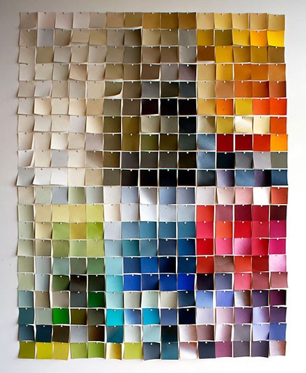
The thing I love most about paint is finding a color that doubles or triples as other colors.

Take for example Kalamata Olive by Martha.  It can look plum, it go go brown, and it can look grey, all depending on how the light hits it - the intensity and length of light and what direction the light is coming in at all effect the shade.


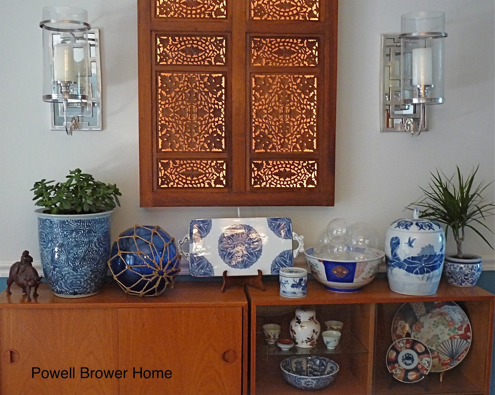
Another favorite of mine is White Mint by SW.  I can't jock this paint color enough.  I have it in my living room/dining room/kitchen and depending on the time of day, it moonlights as a white, a mint green and aqua blue.  A true chameleon.  

Perhaps the attachment comes out of my futile first efforts to get a whisper of an aqua on my walls.  I have intense morning light from the east, but very little afternoon light because of the shade.  I was dead-set on painting the room Organza by Ralph Lauren and paint, I did.  It lasted about two months, until I walked in after a week's vacation and saw it as a little old lady blue.  Bleghk.  So I stalked my favorite vacation eatery and asked them to share the paint they had on the walls.  It was a white with a minimal tinge of green.  Perfection!  Turns out it was White Mint.  A few coats later and some eyes rolls from Mom and Hubby, and I was back in business.

Some of the best advice I've read regarding paint was from editor-in-chief of Southern Living, Lindsay Bierman, who relieved many a neutral-fan around the globe when he said (and I'm paraphrasing here) 'Let me save you some trouble.  If you're looking for a wonderful warm white, without the yellows or peach tones, try Ivory White by Ben Moore.  I've searched high and low and this is IT.'

I love a good chameleon paint color.  What better deal can you get than four shades in one can?  What are some of your favorites?

-Bethany

Thinking an interior design consultation is too expensive?  We have design services starting at $50!  Contact us for a listing of our services and prices; we'd love to work with you to make your home uniquely 'YOU'. 
xoxo  Nancy and Bethany

Monday, February 27, 2012

My hallway is officially zhushed!

Remember this post on zhushing up my hallway?

I was finally ready to execute on this idea.


I started out with this 'inspiration pic' from Atlanta Homes Magazine.


I wanted to do wallpaper, but since we don't plan to stay in our house forever, I thought I'd better save it for the master bedroom.  So mom and I got to work making a stencil. We made a pattern similar to the inspiration pic. We used acetate folders from Staples to make our stencil and some leftover paint from my office (you would be suprised how little paint this took up.  We maybe used a half of a cup of paint).  The project cost us a total of $2.


Since I wanted the walls to look more like handpainted wallpaper versus stencil-y, we painted it with a paintbrush following the stencil as a guide. 


 The stencil and the laser level kept us on the right track and made the pattern uniform. While our application of paint was very measured so it would looked handpainted.


Ta Da!


From a distance it looks like a unified design or even papered (if you really squint).  But up close, the paint strokes and the amount of paint is very uneven. Being a perfectionist, it was actually kind of freeing to do this imperfectly.  I love it so far!  Now we are left to decide whether to do this to the other side of the hallway or not.  I am worried it may feel like a maze if we box it in with both walls painted.  Thoughts?

What did you get into this weekend?

-Bethany


Tuesday, January 31, 2012

Hallway Zhushing

Thank god for Sue over at The Zhush, without which we'd never have such a fitting adjective in circulation that describes the process of amping something up.

Have I mentioned I live in a cottage?

Thought so.

This means every inch counts.

Even the hallway, folks.

So I've been trying to figure out something I could stencil in my hallway without being overkill.  

So I was thinking…

(and tell me if this is gag-worthy or not)

about doing a light greige stencil on the hall wall.

I have a gallery wall going already.  

And tons of lighting to choose from. 

So all I would need is some paint, a stencil and a new rug.


                                  OR       


-Bethany