
Here's the other model townhouse by Ryland Homes. This entire home is done in grey and yellow, black and white.
While there are some interesting features (like the stone tiled wall), let's see what you think about this one!
Entry level family room:

2nd level kitchen,

living room (sorry for the poor photography!) with an inset wall mounted fireplace feature,

and family room opposite the dining room- all on 2nd level.

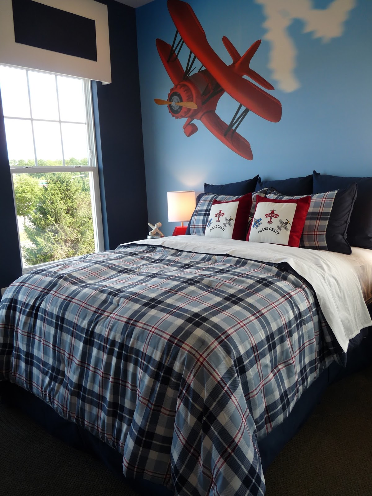
3rd level master, nursery and boys room:


While there are interesting treatments and items in each home I feel like Im looking at a store, which I guess is what a model home is! There is a slickness that comes from a contrived staged room that lacks texture and a homeowner's collection of personal items. When Bethany and I say we like a "collected" look in a home it tells more about the homeowner; who they are where they've been, their history, their families, their loves.
I welcomed your comments yesterday and wonder if you like this one better?


I like this one so much better! You can breathe in it. I love the soaring ceiling on the entry level. It may be lighting, but the warm beige block wall seems too warm for the cool gray of the paint and furnishings, but not offensive. I like that the pattern was at the top of the curtain panels, to lift the eye, but also prevent too much visual activity at floor level.
ReplyDeleteThe second floor was cohesive, but over-staged to me. I think you said contrived, which I agree with. It has no sense of warmth and personality.
The nursery was sweet and at least had something a little different for a light fixture. Master bedroom and boys bedroom were "ho hum". The plane seemed over scaled.... too "in your face".
I do like this one better but I think they both have that contrived "store" feel. This one is less cheesy looking to me.
ReplyDeleteThis one is better, but still, too staged! There is a fine line between staging a model, staging a home for sale, and designing a home to live in. A developer wants to sell homes, not furniture and needs to find the right level of design. Developers try too hard! The buyer walks away remembering the furniture and accessories and not the home! Yes, like you said....it looks like a store! But, it's done over and over. People love to tour models for ideas to use in their homes. When I was a Realtor specializing in new construction the majority of our traffic were people looking for "ideas" not looking to buy a home.
ReplyDeleteI agree...They did a good job within a tight budget... but it is very staged!
ReplyDeleteThe first thing that caught my eye was the gray wall and chevron drape against the stone wall...yuk. I love the use of stone to warm up a modern room, but this just doesn't work IMO. The house is cold and unappealing to me, but I'm not a fan of yellow and gray. When I walk into a model home as a buyer, I want to feel immediately at ease within the house. The first house was claustrophobic to me and this one feels sterile. Too many distractions from the actual home- if that is what they wanted, it was a success. If they wanted to highlight the home- big fail.
ReplyDeleteJust my personal opinion. I'm sure it would delight the right buyer, that just wouldn't be me. :)
I too like this one better mainly because of the color palette. The blue and green in the last one looked like hospital scrubs. But I agree it looks like it came right out of a store. It's missing a personality. I actually like the yellow houndstooth rug even thought I don't think I could live with it.
ReplyDeleteBoth homes are way too full of the current trends for my liking. I think a collected look could still be achieved in a model home, by embracing a few trends, be it a color palette, hot pattern (like the the bold geometrics) or an overall style and adding a few personal or signature touches. The reality though is that your average home buyer is probably not well educated on all of the trends and would find both of these homes to have a fresh look even if it is a bit "store like!"
ReplyDeleteI like the cornice above the crib, the kitchen is pretty minus the barstools, and I like the coffee table in the second living room. Otherwise, I'm with you it feels too much like a store.
ReplyDeleteTotally like the second one better. I feel like it was designed better. It still feels a bit sterile but overall I think they did a good job. I absolutely love the faux window treatment in the nursery.
ReplyDeleteThis one is better. I like the window treatment in the living room. My son would have loved an airplane on his wall when he was young.
ReplyDeleteTHis one is more inviting the first model home was quite dark and austere. I think this one has brightened up, sitll a bit too trendy for me but I can see that it is eye catching.
ReplyDeleteBest xo Karolyn