When some of you suggested I bit off more than I could chew, I thought 'nah, I can do this'. Well, I do have another day job, a huge beckoning yard AND I didn't factor in mistakes, so this was a great learning experience for me.
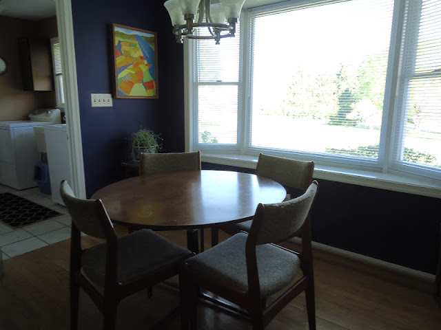
Here is my breakfast room BEFORE:
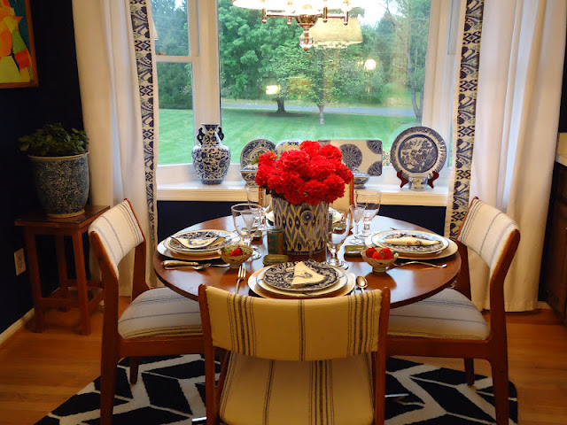
Here is the AFTER:
I do want to know how to make all these things, so I took on the challenge and the deadline. (which was the hardest part!) So many of my rooms are not 100% finished, so this made me realize all the little finishes I need in some of my other rooms, cause IT REALLY MAKES AN ENORMOUS DIFFERENCE! (duh)
Here is my breakfast room BEFORE:
Here is the AFTER:
 |
| (alright I seriously need to makeover cabinets and counters next, maybe a pendant light ASAP ) |
I do want to know how to make all these things, so I took on the challenge and the deadline. (which was the hardest part!) So many of my rooms are not 100% finished, so this made me realize all the little finishes I need in some of my other rooms, cause IT REALLY MAKES AN ENORMOUS DIFFERENCE! (duh)
One of the big challenges was my faux roman valance over the kitchen sink. I watched a few online videos and researched directions, but getting those folds straight and aligned without sagging was tricky, to say the least. AND, in my blinding effort to forge through this I accidentally cut the extra length off my shade on the width end (and made it 42" wide) not on the bottom of the shade. So I had to piece another width to the side of the valance so it would span 54" and then add another piece of lining to the back all seamlessly so no one would notice. I think I pulled it off. My husband helped talk me off a ledge at midnight one night 'cause I was bound and determined to get it installed in one day. It took me one whole day to make a little valance!
Here area my Danish modern (MCM chairs that are 40+ years old) BEFORE:
Here is my light fixture BEFORE (I upgraded 5 years ago to stainless and never was thrilled with):
and here is my new fixture, AFTER:
The trim fabric ,Sumter Ikat Sky, was added to white panels from West Elm, BEFORE:
DURING:
with assistance from the cat:
AFTER:
My kitchen window BEFORE, sans valance:
DURING: ( see big mistake here)
with faux roman valance AFTER:
Add the Jill Rosenwald "Fallon" rug:
Here are some more pics from our own photo shoot:
Total cost of makeover = $406.
light fixture $89.99
Drapery panels: $40.00
2 yds. Trim fabric: $17.96
2 yds. Seat fabric: $121.45
Scotchguard $7.99
Rug $129
Thank you Linda, the founder and fellow "undaunted dozen" for joining in this challenge and pushing us to finish a project! Can't wait for Spring Into Action, Part 2 -- no time soon, please!
Kerry at Design du Monde
Suzy at Saved by Suzy
Tiffany at Living Savvy
Laurie at Traditional & Modern
Cathy at Room Rx
Carrie at Hazardous Design
Lisa at A Room with A View
Sam at The Junk House
Becca at from Gardners 2 Bergers
Jean at Flower Hill Design
Linda at My Crafty Home Life


It looks fabulous. I love all of the blue and white accessories and the the MCM set is gorgeous. The thing I really like about the reupholstering is that you did not match up the stripes. It is so unexpected and kind of Zen-like. I never would have thought of that. I'd still be swearing up a blue streak trying to get them perfectly lined up.
ReplyDeleteNice room.
It looks great! I love the trim on the edge of the white panels! You really pulled it all together!
ReplyDeleteNancy...we really were working together. I was up until midnight, too. This room is so beautiful. I think this is the perfect portfolio piece for your services. You really have a way with mixing it all up. The chairs, love them. The chandelier, I know you had a dent, it looks perfect now. Your shade...very hard. My friend, Barbara did a tutorial
ReplyDeletehttp://hodgepodge-babselou.blogspot.ca/2011/06/how-to-sew-roman-blind.html
Yours looks great. I love that you made trim, and the pattern, again...great. One question, I am sure you have seen a lot of ready-made panels, do you love the West Elm ones? I have never seen them up close, and am always looking for a good ready-made.
I read Barb's post, after I made this. But will use it for my laundry room valance NEXT. I love the West Elm panels. I got the cheaper ones, Bethany bought the more expensive ones for her living room. Hers look like linen, mine are a tighter weave, not so heavy, but certainly a basis for playing with...Thanks for your comments Linda, I feel kindred to you now over these projects!
DeleteWish we lived close so we could share coffee, or wine!
Aww, me too!
DeleteOh my word Nancy, this is simply amazing! I can't believe how many projects you took on for this challenge! I love all of it, from the color, to your choice of fabrics. to how beautifully pulled together it all is. Fantastic job!
ReplyDeleteCathy
I love all your blue and white pieces!!! Where did you get the Ikat vase with the flowers in them? I want it!!
ReplyDeleteLooks like you worked hard!
Hi Janna,
DeleteIt is actually an Ice Bucket from Home James! I indulged in a year ago, and it has been in my cupboard hiding. It really needed an audience, and when there were no other patterns in the room, it wasn't enough to stand on its own! Thanks for the comments.
You did a great job. Love the blue-and-white pattern mixes. You did a lot in the three weeks - very impressive. All the items are perfect - love the rug and drapes and you have the perfect window to showcase those pieces.
ReplyDeleteWow!!! I LOVE the ikat fabric and you did an great job on the roman shade. I can't tell there was a mistake at all. I'm a bit envious of your blue and white ceramic collection as well. I could use some for my new shelves :)
ReplyDeleteCongats! It looks wonderful! You did really well on mixing your patterns, something I'm trying to learn to do before I go any further in any of the rooms in our house. I, like you, need to put in those 'little details' to finish off a few rooms, OK, so you got me, the whole house, haha... Can't wait to see what else you come up with. Any advice or hints on mixing patterns?
ReplyDeleteCindy Sue
Hi Cindy Sue, Thanks for stopping by to comment! I use a rule of thumb,"small, medium large" for mixing patterns. I think you can use stripe, floral, geometric as well, as long as the scale seems to gel together.
DeleteJust play with it and re-tweak a million times!
best of luck!
Looks great Nancy! Big pat on the back. I also love your blue and white ceramic collection!
ReplyDeleteSeriously amazing, my friend! That before and after made my jaw drop! Every detail was well thought out and fits in so nicely! My favorite is the ikat trim! Also, loved your styling right down to the strawberries!
ReplyDeleteI LOVE it, and the blue and white china is gorgeous!! This was an amazing transformation.
ReplyDeleteHappy Thursday.
Teresa
xoxo
You got an amazing amount of work done! Looks beautiful!
ReplyDeleteWhat a transformation! I love the Ikats and stripes fabric (really like that one) from Calico.....thanks for sourcing it. The rooms looks so updated and punchy / full of life!! :-) Thank you for sharing with all of us. It looks amazing. Have a great weekend, Loi
ReplyDeleteYour kitty is so charming! :)
ReplyDeleteYour space looks awesome!!! So dramatic! I love the navy and white. I just checked out the chair fabric link- I super duper love it- {though not the price, wonder if I could DIY something similar?}
ReplyDeleteExcellent job, really, I love it!
xo Becca
I just found your blog through Charmaine and I love the color blue you chose for the walls. It looks amazing with the white molding. Job well done. I also have a kitchen that is in need and am slowly (like snail speed) changing mine. If you have a sec check out my blog http://theinsanedomain.blogspot.com/
ReplyDeleteI love me a blue and white room and yours has me drooling. I'm so impressed with all the little details, but the trim on the drapes are the icing on the cake. Fabulous job!
ReplyDeleteLove the blue and I love the diningchairs, curtains just everything! You did a wonderful job!
ReplyDeleteTHIS is just beautiful!!! Everything you chose,the patterns, the style, everything, just works so well!!! PS - I must know the color of the walls. I showed my husband these pics, and the first thing he said, "that color!" and he even noted how he loved the crisp white, etc. So, he wants to use it somewhere. Please advise!! LOL
ReplyDeleteWhat an amazing job! You both did a great job. I love it!!
ReplyDeleteTotally impressed! That's a lot of work and you rocked it! The drapes look awesome and I love the new chandelier!
ReplyDeleteWhew! You were busy, busy, busy! Looks great!!!
ReplyDeleteSuperb transformation!! I love your mix of colour and prints, and your attention to detail (like those amazing napkins!!!). Thank you for your kind comments and for following my blog! Following you back now :)
ReplyDeletexo
Tiffany Leigh
thedesignerlifestyle.blogspot.com
Wow! You finished so many projects over the past few weeks! The room looks great!
ReplyDeleteOh my goodness, I LOVE your breakfast room. You did an amazing job! I have an obsession with blue and white and the way you used it here is beautiful! You have some serious DIY skills and I'm jealous.
ReplyDeleteThis is just a stunning makeover!
ReplyDeleteCamille
The house is just fantastic....you turned out it so smart and eye pleasant.
ReplyDeleteplantation shutters clayton, ca
The room looks amazing!I love the new light fixture & it looks like you have a beautiful view out that window. Nicely done:)
ReplyDeleteI can't believe you made the curtain trim. It's fabulous and I love the idea of not being limited to ore made trim you find in stores. This opens up an entirely new realm of possibilities. What a great make over
ReplyDelete