It can get mighty confusing arranging and rearranging our rooms, as Bethany and I obsessively do! There are alot of "rules" in decorating, so hopefully these tips can help you arrive at the perfect balance in your decor! Here are a few I've learned and have come across, although I know this list can be added to. And remember, rules are meant to be broken, so take it with a grain of salt!
AREA RUGS:
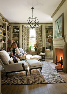
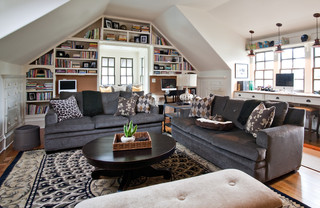
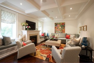
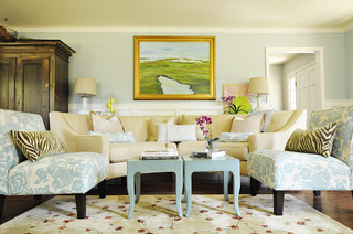
There should be 18" minimum of bare floor around an area rug. You should arrange the furniture the way you want before buying the rug. Either all furniture legs on the rug, or all off the rug, are general rules.
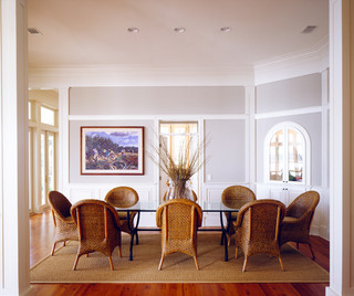
For under a dining room table you generally want at least 24" of rug to extend beyond the table so chairs can be pulled out and still be on the rug.
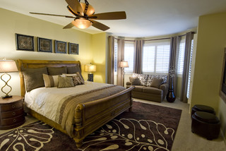
For under a bed, the rule is for a rug to extend 12-18" around the perimeters of the bed. You can always angle a smaller rug under a corner of the bed, for a special affect.
Layer area rugs over carpet to create a more luxurious look, and protect your carpet underneath. Always use rug pads under area rugs.
CHAIR RAIL:
Approximately 32"off the floor depending on ceiling height. Measure your ceiling height and divide by 3.
DRAPERIES:
Hang a minimum of 4" above window, but to the ceiling is preferable. Your drapery rod should be 4" to the outside of your window, and 4" above the top and not on the window frame.
You can also put the drapes 1/2 way between the window frame and the ceiling. Your draperies should be 2 x the width of the window at a minimum so as to not look "skimpy". Let them touch the floor or have a little break in the fabric, but "puddling" definitely depends on the style of furniture, pets, etc. Shades, blinds, etc. should not be the only feature on the window, but layered with fabric drapes for softness and appeal.
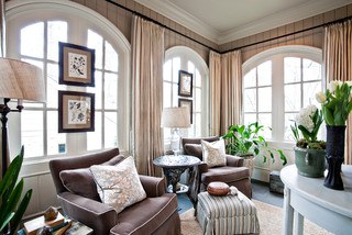 |
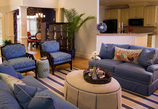
| traditional family room design by Atlanta interior designer Sherry Hart |
ARTWORK:
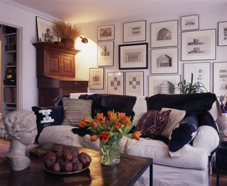
Pictures should be hung at the average persons eye level. So if your'e 6'5" hanging at eye level will be over the heads of your guests! Frames do not need to match. Over a sofa, you should start your grouping at least a hand's width from the back of the sofa ( for me that's 6") or kneel on the cushions and hang the pictures at eye level from there. If you have tall ceilings you can hang your pictures vertically up the wall, just as long as you can still view what is in the frames well. Large paintings work best with high ceilings, so the subject matter can easily be viewed when standing in the room.
Groupings and collages are very trendy right now, and personalize your art with photos, and pieces that mean something special to you.
(more on groupings, hanging art and using mirrors later)
CHOICE OF FURNITURE:
Matching sets can sometimes get boring. If you have a set you love, split it up and use the pieces elsewhere. Choose pieces that add interest and a bit of your history in addition to current pieces that bring you up to date.
Scale has everything to do with the size of your room. If you are forced to use things from a previous home that are oversize, do some editing and only use some of the pieces, like the sofa or loveseat, and get smaller chairs to fit your space.
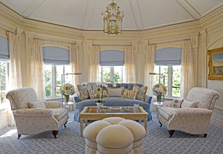
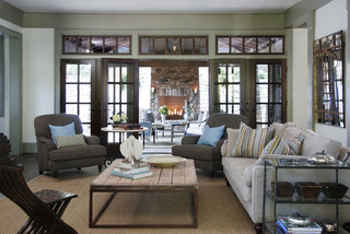
Don't line your walls with furniture, but try to " float" it around an accent rug, or create casual groupings that invite conversation and warmth.
For arranging furniture, start with your largest piece facing a focal point in a room. Work down to your smallest pieces. Move your sofa out from the wall 3- 6", so you are not crowding it up against the wall so it can "breathe"!
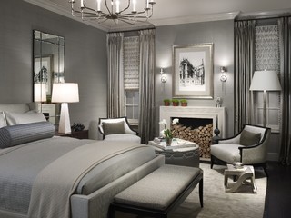
 |
|
|
ACCENT TABLES:
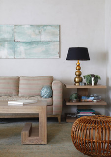
They need to match the height and length of the arms of your sofa and chairs. Coffee tables need to match seat height or be a little taller. Coffee tables that are too low are awkward to use comfortably and can play tricks on the eye by confusing the lines in the space.
Lighting:
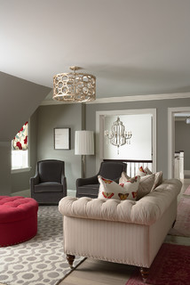
During my 12 year tenure as an accessory designer for an Atlanta-based interiors company, we were taught to divide a room into quadrants. And every quadrant should include lighting. Do not rely on recessed lights as your major light source. An assortment of floor lamps, table lamps, overhead and accent lamps complete a look that conveys mood, function and style.
CHANDELIERS:
For a foyer, measure the room and add the dimensions together to get a suggested diameter of the chandelier (for example, a 12' x 16' foyer = a 28" diameter fixture). Make sure it hangs at lease 7 ft. from the floor to ensure it clears above the height of most people.
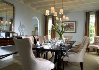
For a dining room table, the width of the chandelier should be 2 feet narrower than the length the table. It should hang 30" from the table top for 8 ft. ceilings. Add 3" in width for every foot added to ceiling height.
For a dining room table, the width of the chandelier should be 2 feet narrower than the length the table. It should hang 30" from the table top for 8 ft. ceilings. Add 3" in width for every foot added to ceiling height.
LAMPSHADES:
The diameter of the shade should the same size as the distance from the lamp base to the bottom of the lamp socket.
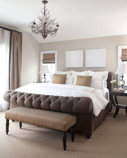
In a bedroom the nightstand lamps should be as high as your headboard and the endtables should be as tall as the mattress!
Of course there are exceptions to all of these rules, so I just refer to these bullets when I need some guidance. Sometimes there are no rules for a well put together room.
traditional bedroom design by Denver interior designer Chalet
traditional bedroom design by Denver interior designer Chalet
Do you have any tidbits that you use, that I missed?
I'm sure some will come to me after I post this...
I'm sure some will come to me after I post this...
Take care lovelies!
-Nancy




Really useful posting!
ReplyDeleteNancy - this is wonderful info to have. Thank you for sharing - I'm sure I will refer to it often!
ReplyDeleteJeanne
great tips! thanks so much for sharing!
ReplyDeleteOoh, I'm saving this post. I'm an offender of some of these tips. The worst is when people hang their drapes right at the height of the window. Definitely not an offender of that one.
ReplyDeleteThanks!
Such a great compilation of so many interior design guidelines! A few of these I knew & some I didn't, but it's great to have something to refer to. I always choose my lampshades by sight, but it's good to know that there's a method to the madness! :)
ReplyDeletedayka